Designing Layouts with CSS Gridbox
Let's take a look at CSS grid and how we can use it to implement our own 12-column layout grid.

Front-end Engineer developing bugs with JavaScript, TypeScript, React & Next.js and Vue & Nuxt. Casually writing dev articles.
It's been a while since I wrote on CSS. As my first CSS article in while now we'll take a look at grids in CSS. We'll then head on to implement a 12-column grid and a small gallery of images in a mosaic layout with our new knowledge.
Please note that this isn't an introductory article to CSS. Hence, you're required to have at least basic knowledge of CSS concepts like positioning, box model and so on. However, you don't need to be a pro to get the most out of this article.
Introduction to CSS Grid
If you've used a CSS library like Bootstrap, you'd know grids allow us to design pages by placing elements in rows and columns. Libraries help us achieve this quickly and easily, but they abstract the behind-the-scenes concepts from us.
With CSS Grid, we do not have to depend on a library, as CSS comes with a display type called grid, like inline, block, inline-block, flex, and so on...
Using the grid display gives us access to loads of different properties that'll help us design a modern grid-based UI that our pages need.
Create a project folder with
index.htmlandstyles.cssfiles in it. Link the CSS file in the HTML file. From now on, you'll be editing those files with the examples I give here, just to see the results.
Support
You can check out this support table for CSS Grid to learn which browsers support this feature and which ones do not. To enable support for unsupported browsers, see this polyfill.
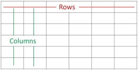
Rows versus Columns
Generally, in a grid, the vertical arrangement of items/cells is called a column, whilst the horizontal arrangement of items/cells is a row.
In CSS, a column is the arrangement of elements down the viewport, whilst a row is the horizontal arrangement of elements across (to the right of) the viewport.
Defining a Grid Container
To put several elements in a grid layout, we have to first create a parent container which holds all the elements. For example, if we want to display 3 DIV elements as columns, we'd surround them with an outer element (e.g. <section>, or another <div>). This parent element is styled to have a display of grid, making it a grid container.

In the image above, the grid container is a rectangle with a black border, and the three squares it holds are the grid items.
To implement this, let's write our markup:
<div class="grid-container">
  <div class="grid-item">
    Item 1
  </div>
  <div class="grid-item">
    Item 2
  </div>
  <div class="grid-item">
    Item 3
  </div>
</div>
Style the grid items as follows:
.grid-item {
  height: 150px;
  padding: 50px 0;
  text-align: center;
  box-sizing: border-box;
  font-size: 1.5rem;
}
.grid-item:nth-child(1) {
  background: red;
}
.grid-item:nth-child(2) {
  background: yellow;
}
.grid-item:nth-child(3) {
  background: green;
}
Let's make the outer DIV a grid container. To do this, simply set its display property to grid like so:
.grid-container {
  display: grid;
}

Now, the outer DIV is a grid container and the three DIVs in it are grid items. But still, our layout hasn't changed.
Defining Grid Columns
Before our grid container starts acting like it we need to define the columns it should have. We can do this with the grid-template-columns property on the grid container:
.grid-container {
  display: grid;
  /* defining 3 columns each with a width of 33.33% of the grid-container */
  grid-template-columns: 33.33% 33.33% 33.33%;
}
Now, we have our first grid layout:

Explanation:
The value of the
grid-template-columnsproperty is three33.33%separated with space. This defines three columns on a row, each with a width of33.33%of the grid container.You can use
px,em,cm, or any dimensional unit.Though we didn't explicitly define a row, the browser automatically created a row and placed the grid items accordingly in their columns. We'll cover defining rows explicitly.
We could've defined two columns on a row instead, one longer than the other:
.grid-container {
  display: grid;
  /* defining 3 columns each with a width of 33.33% of the grid-container */
  grid-template-columns: 40% 60%;
}

You can see that the first column in the first row takes only 40% of the width of the grid container as we defined, and the second on the row takes up the remaining 60%. But there's something else: the third grid item is automatically pushed down.
This is because we specified that only two columns should be on a row. Therefore, since there isn't room for another item on the row, the very next grid item is pushed to a new row, which is, once again, automatically created by the browser without our consent. On the second row, you can see that the third grid item also takes up 40% of the row.
It's important to note that the definition of the specification of a column in a grid applies to all columns, except those defined otherwise.
There's an issue though. If we want six columns on a row, all having the same width, how will you define it? Would you divide 100% by 6 and then repeat the value 16.6666666667% six times?
.grid-container {
  grid-template-columns: 16.6666666667% 16.6666666667% 16.6666666667% 16.6666666667% 16.6666666667% 16.6666666667%;
}
Well, you don't have to.
The fr Unit
CSS Grid provides a flexible unit called fr, which is a fractional unit. If we provide a value like 2fr, it means 2 parts of the space available.
If we have 3 columns in a row and they all have the same fraction size, say 1fr, then the available space would be shared equally amongst them; we wouldn't have to do any complex calculations to ensure that.
So, for our 6-column grid above, we could write this instead:
.grid-container {
  grid-template-columns: 1fr 1fr 1fr 1fr 1fr 1fr;
}
Re-write the grid container to have six grid items instead:
<div class="grid-container">
  <div class="grid-item">1</div>
  <div class="grid-item">2</div>
  <div class="grid-item">3</div>
  <div class="grid-item">4</div>
  <div class="grid-item">5</div>
  <div class="grid-item">6</div>
</div>
Ensure that the colour of the text in all the grid items is #fff, just so you can see the labels clearly; and modify their background colours:
.grid-item {
  color: #fff;
}

/* Give odd grid items gray background */
.grid-item:nth-child(odd) {
  background: gray;
}

/* Give even grid items black background */
.grid-item:nth-child(even) {
  background: black;
}
Please, the above styles aren't required to create a grid. I'm only writing them to ensure we see all the grid items correctly.
Now, our grid looks like this:

So, you can see that all the grid items have the same width. What happens when we use this column definition instead:
.grid-container {
  grid-template-columns: 1fr 2fr 1fr 2fr 1fr 2fr;
}
Here's what happens:

Grid items 2, 4, and 6 are twice as large as grid items 1, 3, and 5. The higher the fraction value, the higher the rate at which a column takes up the available space.
The repeat() Function
Things get even more awesome when we use the repeat() function. You see how we wrote the 1fr and the 16.6666666667% six times? We could've achieved the same effect by doing this:
.grid-container {
  grid-template-columns: repeat(6, 16.6666666667%);
}

/* OR */

.grid-container {
  grid-template-columns: repeat(6, 1fr);
}
The effect would be the same:
This could be read as "repeat 6 times, the value 16.6666666667%", or "repeat 6 times, the value 1fr".
The same thing could be done with the example where the even grid items are twice bigger than the odd ones:
.grid-container {
  grid-template-columns: repeat(6, 1fr 2fr);
}
It's not always compulsory to use fr for all columns. You could mix all dimensional units:
.grid-container {
  grid-template-columns: 1fr 40px 10% 1fr 5em 2cm;
}

Personally, I've never done this.
Grid Rows
As we saw earlier, by default, when a row isn't defined, the browser automatically creates one after grid columns are defined, but we can specify how many rows we want, and how long the rows should be.
Initially, the grid items themselves had their heights defined as 150px, and padding of 50px 0. Let's take off the height and padding properties so the .grid-item class looks like this:
.grid-item {
  text-align: center;
  box-sizing: border-box;
  font-size: 1.5rem;
  color: #fff;
}
Re-write the .grid-container class so the element has only 3 columns in a row:
.grid-container {
  grid-template-columns: repeat(3, 1fr);
}
Now, we have 3 columns on rows 1 and 2 which are automatically created by the browser.

After we stripped the height and padding properties away, our DIV elements, as usual, have their heights set to auto, which simply means their heights are as long as the heights of the content inside them.
To demonstrate this, let's populate the first grid item with the dummy text below:
Lorem ipsum dolor sit amet consectetur adipisicing elit. Beatae, officiis.

Now, all the items in the first row have the same height as that of the first grid item. That's the behaviour of grid rows in CSS. By default, the height of a row is determined by the grid item with the largest height value.
Defining Grid Rows Explicitly
Explicitly defining rows is as easy as defining columns: use the grid-template-rows property on the grid container, and write the number of rows you want by specifying the height for each:
.grid-container {
  grid-template-rows: 150px 150px;
}
The code above defines two rows, where the first row has a height of 150px and the second the same.

As you can see, we've defined 2 rows with the same height, and even though we didn't specify the height of all the grid items, they've automatically adjusted to the specified row height, i.e. 150px.
Of course, the values may vary: we could have this instead, 150px 100px; which sets the height of the first row as 150px and the second as 100px.
What happens when the content in one grid item overflows (has more height than the grid item itself)?
Here, I've copied the dummy text and pasted it again:

The text in the first grid item overflows its parent and goes behind the fourth grid item, which is unexpected.
The minmax() Function
As its name suggests, the minmax() function in CSS is a shorthand for defining the minimum and maximum dimensions of rows and columns.
It sets the minimum and maximum heights of rows, and the minimum and maximum widths of columns.
Syntax
minmax(minValue, maxValue)
Where
minValueis the minimum width/height of a column/row.maxValueis the maximum width/height of a column/row.
Let's re-define our rows:
.grid-container {
  grid-template-rows: minmax(100px, auto) minmax(100px, auto);
}

In the example above, we defined two rows, each with a minimum height of 100px and a maximum of auto. This means the smallest height both rows could have is 100px, and auto means it can expand infinitely depending on how much content is in the grid items.
We could've specified a fixed height of, say, 300px, this depends on whether you can estimate how much height your content would take.
You can see that only the first row has a height greater than 100px, because the first grid item's content increased its height. Thereby, adjusting the heights of the remaining two on the row.
Using repeat() with minmax()
We can use the repeat() function here too. For example, the code below creates 2 rows, in the grid container with class .example-container, both with a fixed height of 150px.
.example-container {
  grid-template-rows: repeat(2, 150px);
}
We could also specify the minmax() heights instead of a fixed height. So, we could re-write our .grid-container like this, and we'll have the same result:
.grid-container {
  grid-template-rows: repeat(2, minmax(100px, auto));
}
Adding Gaps between Columns and Rows
To add some gutters or whitespace between columns or rows, use the column-gap or row-gap properties, respectively, on the grid container.
column-gap
By specifying 20px we add 20 pixels of whitespace between the columns.
.grid-container {
  /* 10px gap between columns */
  column-gap: 20px;
}

row-gap
By specifying 30px we add 30 pixels of whitespace between the columns.
.grid-container {
  /* 20px gap between columns */
  column-gap: 20px;

  /* 30px gap between rows */
  row-gap: 30px;
}

Shorthand gap
With the gap property, we can specify both the column-gap and row-gap simultaneously.
Syntax
gap: rowGap columnGap;
Where
rowGapis the amount of whitespace between rows (e.g.20px).columnGapis the amount of whitespace between columns (e.g.20px).
Example
.grid-container {
  /* 30px row-gap, 20px column-gap */
  gap: 30px 20px;
}
We can also specify one value only to the gap property and it'll apply to both row-gap and column-gap:
.grid-container {
  /* 30px as row-gap and column-gap */
  gap: 30px;
}
Re-adjusting Column Size with auto-fit and auto-fill
To demonstrate these two values we're going to design a quotes grid, starting from a mobile interface.
So, comment out the markup and the styles for the .grid-container element so we can start afresh with a new element. Also, resize the browser window to a mobile screen size.
Now, edit your index.html file with the code below:
<h1>Quotes</h1>
<div class="quotes-grid">
  <div class="quote">
    <p>
      Lorem ipsum dolor, sit amet consectetur adipisicing elit. Repudiandae
      porro libero recusandae autem omnis vel?
    </p>

    <span>by John Doe</span>
  </div>
  <div class="quote">
    <p>
      Lorem ipsum dolor, sit amet consectetur adipisicing elit. Repudiandae
      porro libero recusandae autem omnis vel?
    </p>

    <span>by John Doe</span>
  </div>
  <div class="quote">
    <p>
      Lorem ipsum dolor, sit amet consectetur adipisicing elit. Repudiandae
      porro libero recusandae autem omnis vel?
    </p>

    <span>by John Doe</span>
  </div>
  <div class="quote">
    <p>
      Lorem ipsum dolor, sit amet consectetur adipisicing elit. Repudiandae
      porro libero recusandae autem omnis vel?
    </p>

    <span>by John Doe</span>
  </div>
  <div class="quote">
    <p>
      Lorem ipsum dolor, sit amet consectetur adipisicing elit. Repudiandae
      porro libero recusandae autem omnis vel?
    </p>

    <span>by John Doe</span>
  </div>
</div>
And the styles.css file like this:
/* Resetting the font */
body {
  font-family: Segoe UI, SegoeUI, "Helvetica Neue", Helvetica, Arial, sans-serif;
}

.quotes-grid {
  margin: 0 15px;
  display: grid;
  gap: 20px;

  /* Notice we didn't define any columns */
}

.quote {
  text-align: center;
  padding: 20px 30px;
  box-sizing: border-box;
  font-size: 18px;
  color: #555;
  border-radius: 8px;
  box-shadow: 0 0 15px #ccc;
}
.quote span {
  font-size: 14px;
  color: #111;
  font-weight: 600;
}
.item:nth-child(even) {
  background: darkgrey;
}

.item:nth-child(odd) {
  background: grey;
}
On our mobile-sized window, the result should be like this:

On a mobile screen, this is okay. But, try resizing the window to tablet and desktop sizes. The layout stays the same because our UI isn't responsive.
We can define 3 columns on the .quotes-grid element:
.quotes-grid {
  grid-template-columns: repeat(3, 1fr);
}
You notice that, whilst this might look okay on the larger screens, it doesn't do well on the mobile screen size; we get content overflowing off the page.
Tablet result:

Mobile result:

This is because we've explicitly specified 3 columns, each taking up 1 fraction of the available space. But the screen size is affecting the width of the grid container, and hence the content in it extends its size (because of the grid items) and goes off the screen.
The first idea that would pop into mind is to use @media queries, but we don't have to.
There's a simpler, shorter way to make it responsive with auto-fit and auto-fill.
The way we do this is by specifying minimum and maximum widths for our columns, and then, instead of explicitly defining 3 columns we'll use auto-fit instead. We'll be using the repeat() and minmax() functions to achieve this:
.quotes-grid {
  grid-template-columns: repeat(auto-fill, minmax(250px, 1fr));
}
Explanation
So, auto-fit or auto-fill is passed as the first argument to the repeat() function rather than specifying a fixed number. The minmax() function sets the minimum width of the column to be 250px, and a maximum of 1fr. Meaning they'll be 250px wide at minimum, and can only take up to 1 fraction of the space available.
Now, on mobile screens we get the normal stack form:
And when we try expanding to a tablet or desktop size:
What's the difference between auto-fit and auto-fill
In the code above, replace auto-fit with auto-fill (in the repeat() function). Notice any changes? No! We get the same result.
The auto-fit value takes all the available columns, puts them in the available space, and expands them till they take up any excessive space left.
The auto-fill value, however, fills a row with as many columns as it can fit. So, when there's a new grid item which can fit in a row, the browser "looks at" the space available and automatically creates a column and fills it in.
If you're still scratching your head I recommend reading this article on CSS Tricks.
Implicit creation of new rows and columns
When we write this:
.container {
  grid-template-rows: repeat(5, 200px);
}
We define only 5 rows in our grid. So, if there are excess grid items which will surpass the number of rows defined, those grid items get cut, in a sense that, they do not get up to the specified height of the row (i.e. 200px in this example).
Sometimes we may not know how many rows or columns would be available in the grid, so it's not right to specify a fixed number.
With the grid-auto-rows and grid-auto-columns, we can just specify the height of a row or width of a column, and it'll affect all new rows and columns that'll be created when new items are added to the grid.
.container {
  grid-auto-rows: minmax(100px, auto);
}
With the example above, we ignore the number of rows we want, because we want the browser to generate them when they're needed. For each row that's created, we set a minimum height of 100px and auto for excessive content.
A 12-column Grid
Let's use what we've learnt so far to implement a 12-column grid. Go ahead and try it on your own and come back and check mine. 😉
First, our markup:
<div class="grid">
  <div class="item">1</div>
  <div class="item">2</div>
  <div class="item">3</div>
  <div class="item">4</div>
  <div class="item">5</div>
  <div class="item">6</div>
  <div class="item">7</div>
  <div class="item">8</div>
  <div class="item">9</div>
  <div class="item">10</div>
  <div class="item">11</div>
  <div class="item">12</div>
</div>
And the styles:
.grid {
  display: grid;
  grid-template-columns: repeat(12, 1fr);

  /* using grid-auto-rows to specify that
  we don't know the exact number of rows available */
  grid-auto-rows: minmax(50px, auto);

  gap: 5px;
  /* gap of 5px between rows and columns */
}

.item {
  text-align: center;
}

.item:nth-child(odd) {
  background: #ddd;
  color: black;
}

.item:nth-child(even) {
  background: #333;
  color: white;
}

It's preferable to specify how many rows the grid should have. You know your design better than anyone, so define your grids in any way that'll be suitable to provide the looks you want.
Grid Lines
It's very important to learn this small concept as it'll help us in the upcoming topics.
We've understood that a grid is made up of rows and columns. These rows and columns create lines that the browser uses to align grid items in the right manner. We can call them imaginary since we don't see them, but they can be seen when we inspect the grid container.
These lines are numbered, and they can help us change how grid items are positioned in the grid by default.
Take a look at this image below:

Sorry if the design is bad. I really suck at Photoshop. 😬
Let's digest this.
As you already know, the horizontal arrangement of cells is the rows, whiles the vertical arrangements are columns.
Though there are 9 columns, we have 10 grid lines; and 7 grid lines for 6 rows.
For the rows, the naming of the lines from top to bottom uses positive integers. While the negative integers (coloured red) denote the opposite, naming from the bottom of the grid upwards. So, you can refer to the first-row line as "row line 1" or "row line -7".
For the columns, the naming of the lines from the left uses positive integers. While the negative integers (coloured red) denote the opposite, naming from the right to the left. So, you can refer to the last column line as "column line 10" or "column line -1".
To denote the column on which the first grid item is placed, we write the column line on which the grid item starts (i.e.
1, or-10), followed by a forward slash (/), then the column line on which it ends (i.e.2or-9).
1 / 2 OR -10 / -9
- The same thing applies to rows. To denote the row on which the last grid item is placed, we write the row line on which the grid item starts (i.e.
6, or-2), followed by a forward slash (/), then the row line on which it ends (i.e.7or-1).
6 / 7 OR -2 / -1
Try to wrap your head around these concepts till you're certain you understand, and then continue.
The grid-row and grid-column Properties
So far we've been discussing properties that only apply to the grid container itself. Let's tackle grid-row and grid-column properties, which are only used on grid items.
The grid-row and grid-column properties are used to change the default positions of grid items in a grid.
They can also be used to increase the number of rows or columns that a grid item can occupy.
Let's take a look at our 12-grid system once again.
At the moment all the grid items occupy one column each, and one row each.
Let's make the first grid item occupy the first and the second column. To do this, we'll use the grid-column property on it:
.item:nth-child(1) {
  grid-column: 1 / 3;
}
Since we have 12 columns, there are 13 column lines.
By default, the column on which the first grid item occupies is 1 / 2, it starts from the column line 1, and ends on the column line 2.
By setting the value of grid-column to 1 / 3, we're saying that the grid item should start from column line 1, and end on column line 3.

As you can see in the above image, item 1 now occupies two columns, thereby pushing the 12th item to the next row (which is created automatically).
Another way we could've achieved this is by using the span keyword. Basically, we use it to let the grid item span the number of rows of columns we want, in this case, 2 columns:
/* When you want it to start from its default starting line, you can ignore the first number */
.item:nth-child(1) {
  grid-column: span 2; /* "Span 2 columns" */
}

/* But if you want to change which column line it starts from, you'd have to specify that line number, followed by the slash /, and then "span #", where # is the number of columns you want to span */
.item:nth-child(1) {
  grid-column: 1 / span 2;
}

/* Start from column line 1, and span 2 columns */
We don't always have to start from the line 1. We could make it start from the line 5, and end on the line 10:
.item:nth-child(1) {
  grid-column: 5 / 10;
}

The 1st item now starts from column line 1 and ends on line 10, leaving the columns from lines 1 to 5 empty.
Let's make the 3rd grid item occupy the empty columns; from column lines 1 to 5. Notice the position of the 3rd grid item in the image above, it's almost at the end of the first row.
/* Selecting the 3rd grid item */
.item:nth-child(3) {
  grid-column: 1 / 5;
}

The 3rd item was wrapped to the second row instead of occupying the first. Why is that? 😕🤔
Well, looking at the result before, after we repositioned the 1st grid item, it pushed the next items, placing the 3rd grid item almost at the end of the row. So, when we specified that the third item be positioned from the column lines 1 to 5, the browser, looking at the current row, knows that there isn't enough space. So, it pushes the 3rd item to the next row and makes it occupy the columns from lines 1 to 5 (on this row) instead. Makes sense?
To tell the browser to take it to the 1st row, we need to explicitly specify that. Guess the property we'll use: grid-row:
.item:nth-child(3) {
  grid-column: 1 / 5;

  /* by passing only one number, we specify which row it starts from, and it'll automatically end on the same row */
  grid-row: 1;
}
And now, we get this:

We could specify on which row line we want the 3rd item to end. Now, it starts at row line 1 and ends at row line 2. So, we can make it end on row line 3 instead:
.item:nth-child(3) {
  grid-column: 1 / 5;

  grid-row: 1 / 3;
}
And this happens:

Cool huh? 😎😁
Let's look at template areas and then head to do the last example, mosaic layout.
Using the grid-template-areas and grid-area Properties
Numbers aren't that friendly, so grid lines could be a bit confusing. With grid-area we can give names to our grid items, and then use grid-template-areas to specify (in quotes "") how the grid items should be placed on the grid.
In our 12-column grid, let's reduce the grid items by 6:
<div class="grid">
  <div class="item">1</div>
  <div class="item">2</div>
  <div class="item">3</div>
  <div class="item">4</div>
  <div class="item">5</div>
  <div class="item">6</div>
</div>
Remove the following code from the CSS file:
.item:nth-child(1) {
  grid-column: 5 / 10;
}

.item:nth-child(3) {
  grid-column: 1 / span 4;
  grid-row: 1 / 3;
}
You should have this result:

To make all the grid items span 2 columns each, we could use the span keyword:
.item {
  grid-column: span 2;
}
This affects all grid items and works fine:

But we could name each grid item with a custom name, using the grid-area property on each grid item. But first, remove the code above from the CSS file, or just comment it out.
.item:nth-child(1) {
  grid-area: one;
}

.item:nth-child(2) {
  grid-area: two;
}

.item:nth-child(3) {
  grid-area: three;
}

.item:nth-child(4) {
  grid-area: four;
}

.item:nth-child(5) {
  grid-area: five;
}

.item:nth-child(6) {
  grid-area: six;
}
So, item 1 is called one, and item 2 is called two, and so on. You can name them however you want, without whitespace of course.
We can now place them in the grid with the grid-template-areas property on the grid container. Please note, this property works on the grid container.
.grid {
  grid-template-areas: "one one two two three three four four five five six six";
}
Open quotes and write them in the order in which you want them, as done above. We repeated each grid area (or item) 2 times; 2 * 6 = 12, right? So, if you want the 1st grid item to span 3 columns, you just repeat its name three times:
.grid {
  grid-template-areas: "one one one two two three three four four five five six six";
}
This makes the 1st item span 3 columns, but the last item on the row is squashed to occupy the space of one column even though we repeated it twice in the template.

How do we make a grid item span multiple rows?
Our grid has 12 columns per row, and looking at this template:
"one one two two three three four four five five six six"
There are 12 columns defined here, and there's only one string (text in quotes). Each string denotes a row.
To add another row, type Space or Enter after the first line and add another template enclosed in quotes:
.grid {
  grid-template-areas:
    "one one two two three three four four five five six six"
    "one one two two three three four four five five six six";
}
I use the Enter key because that way I see the templates on top of each other, like rows on top of each other, so I don't get confused. Feel free to use Space or even Tab.

Now, they all take up two rows each. And that's because of how we've written our second template; we simply repeated the first line, so each grid item takes up two columns on the 2nd row, combining them from the first.
We could do this:
.grid {
  grid-template-areas:
    "one one two two three three four four five five six six"
    "one one two two . . . . . . . .";
}

A dot (.), as used above, simply denotes a blank column. By repeating it 8 times, we create 8 blank columns on row 2, which is why only the first and second grid items span 2 rows each, except items 3, 4, 5, and 6.
Another example of the dot:
.grid {
  grid-template-areas:
    "one one two two . . four four . . six six"
    "three three three three . . five five five five five five";
}
The following result is yielded:

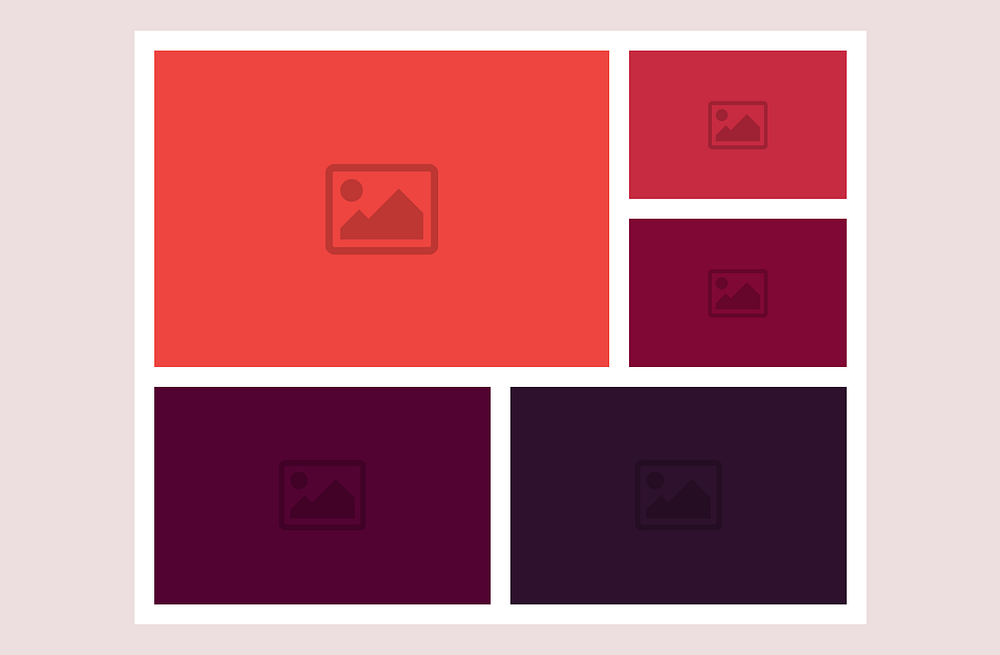
A Mosaic Layout with CSS Gridbox
A mosaic layout looks like this:
I'm not going to code this example here. I'll just leave the markup so you can use it to write your CSS to design the layout below:

Here's the markup:
<div class="mosaic">
  <div class="img-wrapper">
    <img
      src="https://images.unsplash.com/photo-1526415480757-aaff8e7a3882?ixlib=rb-1.2.1&auto=format&fit=crop&w=500&q=60"
      alt="Landscape image"
    />
  </div>
  <div class="img-wrapper">
    <img
      src="https://images.unsplash.com/photo-1551008475-4533d141425b?ixlib=rb-1.2.1&auto=format&fit=crop&w=500&q=60"
      alt="Landscape image"
    />
  </div>
  <div class="img-wrapper">
    <img
      src="https://images.unsplash.com/photo-1544392827-1fc9d8111cb1?ixlib=rb-1.2.1&auto=format&fit=crop&w=500&q=60"
      alt="Landscape image"
    />
  </div>
  <div class="img-wrapper">
    <img
      src="https://images.unsplash.com/photo-1465429103920-30e481ab35b4?ixlib=rb-1.2.1&auto=format&fit=crop&w=500&q=60"
      alt="Landscape image"
    />
  </div>
  <div class="img-wrapper">
    <img
      src="https://images.unsplash.com/photo-1506333438925-a6203045b492?ixlib=rb-1.2.1&auto=format&fit=crop&w=500&q=60"
      alt="Landscape image"
    />
  </div>
  <div class="img-wrapper">
    <img
      src="https://images.unsplash.com/photo-1546268060-2592ff93ee24?ixlib=rb-1.2.1&auto=format&fit=crop&w=500&q=60"
      alt="Landscape image"
    />
  </div>
</div>
These images are from Unsplash.
The number of columns you use is up to you.
Here's a Pen of my solution. I've commented out every step in the CSS, so feel free to check it out after you're done with yours.
CSS Grid is not limited to the concepts covered in this article; there are a lot more.
However, I hope everything mentioned here will get you equipped to start designing awesome layouts with CSS Grid.
Thanks for reading! 🙏