Understanding & Optimising the Critical Rendering Path
Learn about all the stages involved in how content is displayed on a Web page, and how to optimise this render process for faster load times.

Front-end Engineer developing bugs with JavaScript, TypeScript, React & Next.js and Vue & Nuxt. Casually writing dev articles.
There's a lot more to front-end web development than just styling buttons and animating spinners and sidebars. As front-end developers, we're responsible for maintaining good performance for Web pages and improving them.
In this article, we'll be discussing the critical rendering path. And by doing that we'll learn how the browser turns our code, from ordinary text files to pixels on the screen, and how we can optimise the process to make the page load faster.
So, without further ado, let's get started!
What is the Critical Rendering Path?
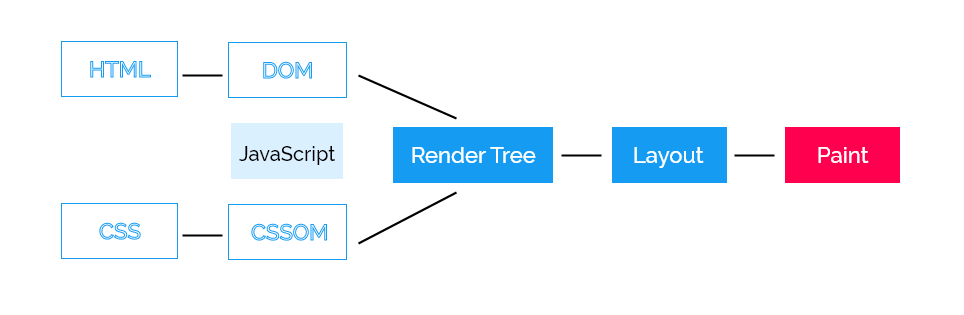
On page load, the browser takes a series of steps to convert the HTML, CSS and JavaScript code into pixels (or viewable graphics). This sequence of steps is known as the Critical Rendering Path, CRP for short. These steps are essential for the initial page render.
The Critical Rendering Path consists of 6 steps:
Construction of the DOM (Document Object Model).
Construction of the CSSOM (CSS Object Model).
Execution of JavaScript.
Constructing the Render Tree.
Generating Layout.
Painting.
Here's a representation of the steps:
Let's talk about the first step: constructing the DOM.
1. Constructing the Document Object Model
Consider the following code in an HTML file that is to be loaded by the browser:
<!DOCTYPE html>
<html lang="en-uk">
  <head>
    <meta name="viewport" content="width=device-width, initial-scale=1.0" />
    <title>Critical Rendering Path</title>
    <link rel="stylesheet" href="styles.css" />
  </head>
  <body>
    <h1>Introduction to <span>Critical Rendering Path</span></h1>

    <p>Lorem ipsum dolor sit amet consectetur adipisicing elit.</p>
  </body>
</html>
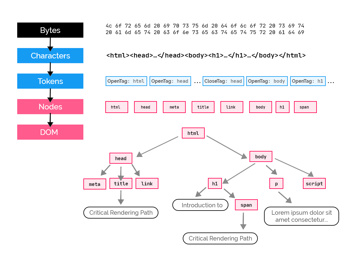
The Document Object Model is an object representation of an HTML document after it has been parsed.
The browser receives chunks of HTML data in the form of bytes. These bytes are converted into text depending on the encoding type (e.g. UTF-8). Then, tags (opening and closing) are recognised as tokens, as nodes (with their respective attributes) and then finally, the Document Object Model is constructed, represented as a tree data structure.
That said, you should note that the HTML file doesn't need to be completely fetched by the browser before it can be parsed. On receiving a byte of data, the browser immediately uses it to construct the DOM till the whole file is received. However, the same thing cannot be said about CSS as it is render-blocking. We'll cover what that means in a minute.
2. Constructing the CSS Object Model
While the browser parses our HTML file above, it encounters this:
<link rel="stylesheet" href="styles.css" />
The browser goes ahead to fetch the external resource, i.e. styles.css, and continues building the DOM. Even though the DOM construction is not halted while the CSS file is being fetched, the browser doesn't display the HTML content immediately. Instead, it waits for the CSS file to finish loading, parses it, and then creates the CSS Object Model - attaching stylesheet rules to their respective DOM nodes.
Unlike HTML, the browser doesn't build the CSSOM when chunks of the CSS file are received; it waits until the whole file is fetched before going ahead to parse it.
The reason behind this is the cascading nature of CSS. Consider the following CSS code:
body p {
  color: green;
  font-size: 14px;
}

/* ... hundreds of lines of code ... */

footer p {
  color: white;
}
At the beginning of the file, we styled all paragraph elements in the body to have a green font colour and a font size of 14px. This rule applies to all paragraph elements in the body element, it doesn't matter if it's a child of another element which is in the body. Here's what I mean:
<body>
    <!-- direct descendant of <body> -->
  <p>Hello world!</p>

  <!-- ... hundreds of lines of code ... -->

  <footer>
        <!-- descendant of <body>, tho not direct -->
    <p id="grand-child">Grandchild of body element.</p>
  </footer>
</body>
The <p> element with ID grand-child is a descendant of the body element, though not directly. Because of this, it is supposed to have a green colour, but when the page is rendered, it'll be white because its color property gets overwritten at the end of the CSS file.
Because of this behaviour of CSS, browsers are programmed to wait for the full CSS file so that they may render the correct styles. Otherwise, when it receives the first chunk of the file which contains the green-colour rule, it would render that, and when it receives the last chunk of the file which contains the white-colour rule, it would now update the UI, overriding the previous rule.
This is why CSS is known as a render-blocking resource; it has to be fully parsed by the browser before rendering can take place. CSS is also a script-blocking resource. For example:
<head>
  <link rel="stylesheet" href="styles.css" />

  <script src="main.js"></script>
</head>
In the above code, before the code in the JavaScript file, main.js, is executed, the CSS file before must be parsed first. We'll learn why soon.
What does the CSS Object Model look like?
Just like the DOM, the CSSOM is an object representation of the styles of all elements, also presented as a tree data structure. These styles include those explicitly written internally (or inline) or external CSS files, and also the styles defined by default by the browser called the user agent stylesheet.
In our HTML file above, the content of the external CSS file to be fetched is:
body {
  font-size: 16px;
}

h1 {
  color: dodgerblue;
  line-height: 2.5rem;
}

h1 span {
  font-style: italic;
}

p {
  font-size: 1.2rem;
  display: none;
}
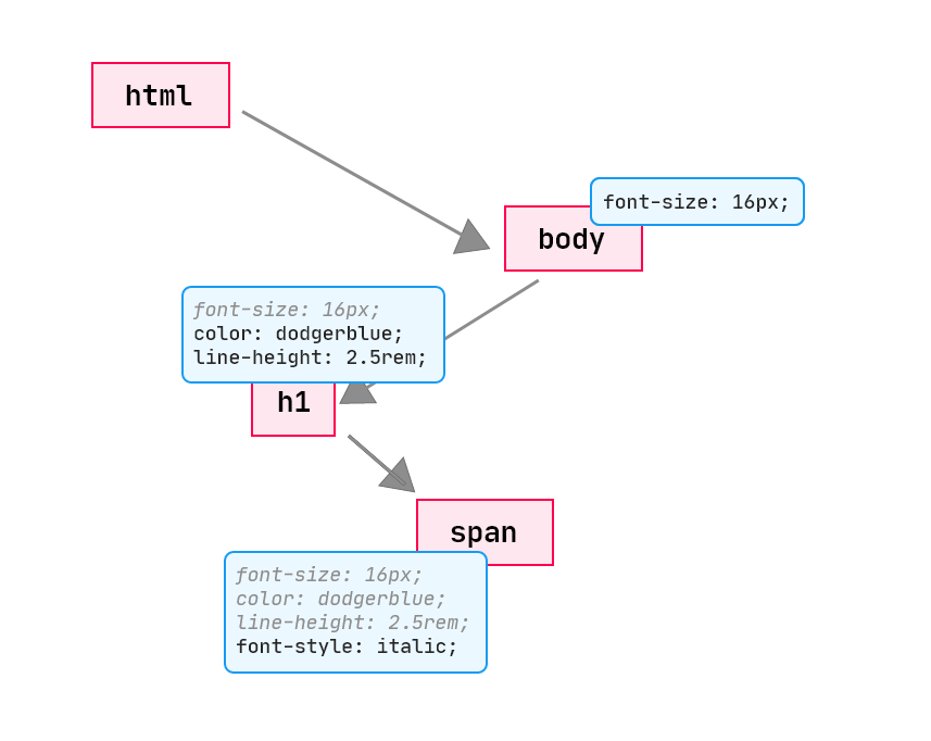
By parsing the above CSS, the browser constructs the following CSS Object Model:
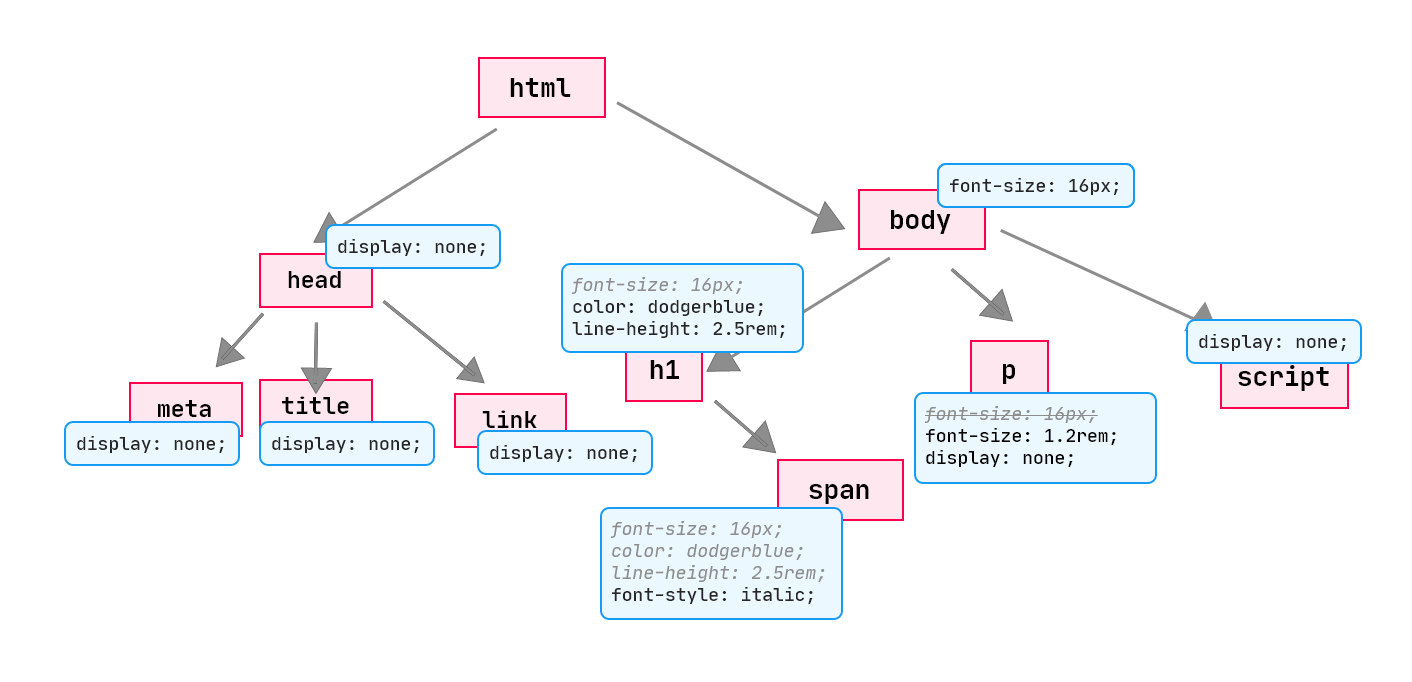
In the above CSSOM, we have
<h1>,<span>(inside of<h1>), and<p>inheriting thefont-sizeproperty from the<body>.All inherited properties are grey and italic, whilst the own properties are black, as shown above. However, for the
<p>element, itsfont-sizeproperty overrides the inherited one, which explains why the inherited one iscancelled.We also noticed that, the
<span>inside the<h1>inherits thefont-size,colorandline-heightproperties from its parent, the<h1>element.The
<head>is styled withdisplay: none;by the default user agent stylesheet from the browser. Inspect the<head>element in the developer tools and browse its styles and see what I'm talking about. The same thing can be said about the<meta>,<title>and<link>elements.
When there's no CSS source, the CSSOM will be constructed with the default user agent stylesheet.
3. Execution of JavaScript
When the parser encounters a <script> tag, it runs its JavaScript source; if it's an external script it fetches it first.
The locations of <script> tags are important because of their potential effect on the Critical Rendering Path. To explain this, let's modify our HTML file:
<!DOCTYPE html>
<html lang="en-uk">
  <head>
    <meta name="viewport" content="width=device-width, initial-scale=1.0" />
    <title>Critical Rendering Path</title>
    <link rel="stylesheet" href="styles.css" />
  </head>
  <body>
    <h1>Introduction to <span>Critical Rendering Path</span></h1>

    <script>
      const p = document.getElementsByTagName("p")[0];
      p.innerHTML = "Dynamically modified paragraph.";
    </script>

    <p>Lorem ipsum dolor sit amet consectetur adipisicing elit.</p>
  </body>
</html>
We'd expect the script to rewrite the inner HTML of the <p> element, right? But no, it doesn't. Instead, we get this error in the developer console (F12 > Console):
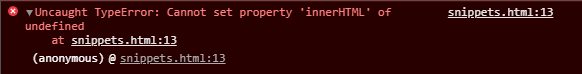
From the error above, the paragraph element, at the time of executing the JavaScript code, is not defined - in order words, it is not in the DOM. Note that the script is placed before the paragraph element.
The reason we didn't get the expected results is that when the parser reaches the <script> tag, it pauses the construction of the DOM and lets the JavaScript engine handle the JavaScript code. At that point, since the parser hadn't reached the <p> tag, it couldn't parse it and build it into the DOM. So, the script tries to access the paragraph element which isn't in the DOM yet, yielding the error we see in the console. This makes JavaScript a parser-blocking resource.
Once the JavaScript engine is done executing the script, the browser takes over and continues building the DOM from where it stopped.
JavaScript can also block the construction of the CSS Object Model. Imagine placing the above script in the <head> tag, right before the <link> tag; what do you think would happen? Before the parser reaches that tag, it pauses its process and hence, the browser doesn't request the CSS file until the script is done executing.
⭐ It is also worth mentioning that, CSS is considered a script-blocking resource because, assuming the parser encounters a CSS source before a script, it'll build the CSSOM before handing over the script to the JavaScript engine to execute.
Preventing JavaScript from Blocking the Critical Rendering Path
How do we combat this? Well, you may know of a solution - by putting the script at the end of the <body> tag, or after it (which is okay, but uncommon). That way, the parser would be done constructing the DOM and CSSOM before executing the script.
Another method is by using the async keyword with external scripts, like this:
<script src="main.js" async></script>
This simply tells the parser to continue DOM construction and only execute the script once it's done, which could have a significant improvement on the Critical Rendering Path.
4. Constructing the Render Tree
The DOM and CSSOM are both independent as they have separate purposes: the DOM describes the building blocks of the content and the CSSOM describes the styles of the document. But, to be able to paint components on the screen, the browser needs the two; how does it combine them?
The render tree is a combination of the DOM and CSSOM that serves as an input to the final stage in the Critical Rendering Path - painting pixels onto the screen. Before content can be made visible on the page, two important information are needed: the DOM and CSSOM. Since they're both independent, the render tree is constructed, joining them.
It is in the render tree that some visually "unwanted" nodes are excluded from the view. What I mean is, when the render tree is built, some nodes are hidden. For example the <script>, <head>, <title>, <meta>, <link> tags, etc. Also, elements that have a display: none in the CSS are also omitted from the render tree. This is done so that such elements are not rendered on the page.
Now, here's the render tree constructed with our HTML and CSS source codes:
Compare the illustration above to that of the CSSOM; you'll realise it excludes the invisible nodes, including the <p> element which was styled with a display: none in the CSS.
⭐ It is important to note that
visibility: hiddenis NOT the same asdisplay: none. The former only makes the target node invisible but it still maintains its dimensions and content, occupying space on the page. The latter, however, completely removes it from the render tree and hence doesn't get painted at all.
5. Generating Layout
At this point, the browser has information on the nodes, along with their respective styles that should be painted on the screen. The only necessary step left is to calculate the positions and sizes of each node on the viewport; where should each node be placed on the page, and how big or small should each be depending on the viewport?
To achieve this, the browser uses the viewport width, which by default, is 980px regardless of what device is displaying the page, unless defined differently using the meta viewport value. Commonly, in the <head> tag, it is written as:
<meta name="viewport" content="width=device-width,initial-scale=1" />
width=device-width tells the browser to use the device's screen width instead of using the default 980px.
Consider the dummy page below:
<!DOCTYPE html>
<html lang="en-uk">
<head>
<meta name="viewport" content="width=device-width, initial-scale=1.0" />
<title>Critical Rendering Path</title>
</head>
<body>
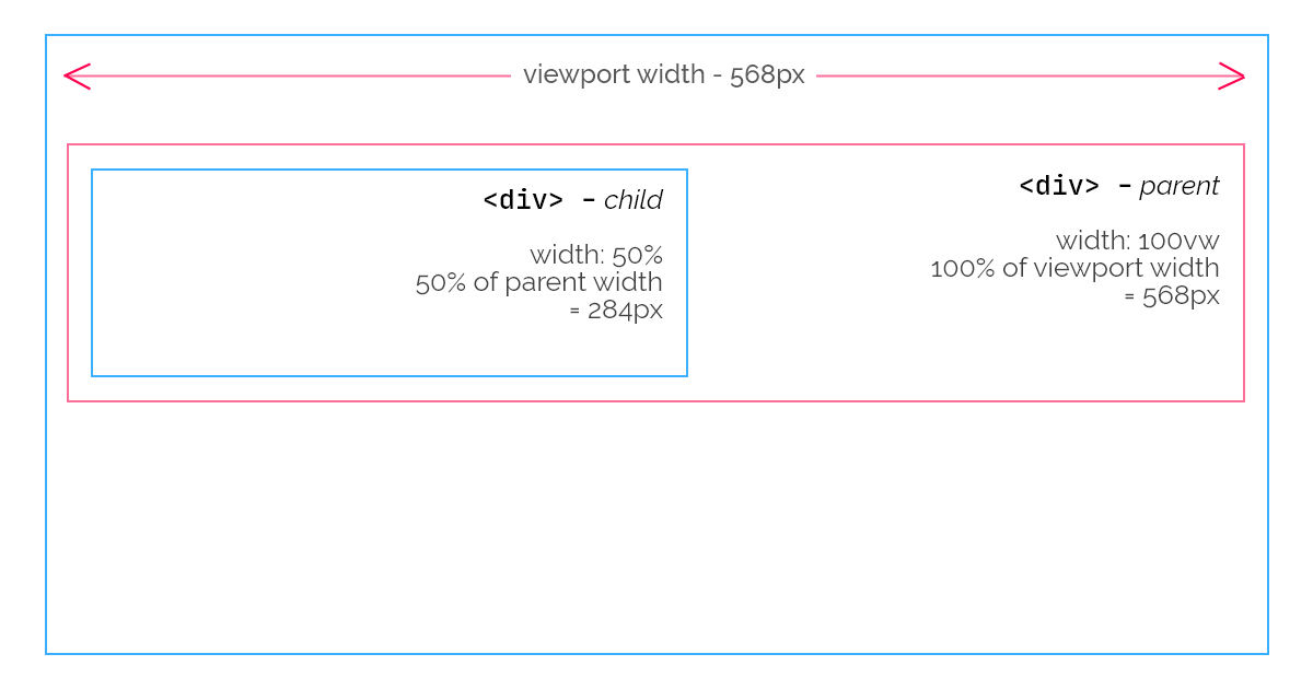
<div style="width: 100vw;">
<div style="width: 50%;"></div>
</div>
</body>
</html>
Assuming you're viewing this page with a smartphone which has a viewport width of 568px, since the width of the first (parent) <div> is set to 100vw (100% of the viewport width), its width will be 568px, equal to the viewport width. Its child, the nested <div>, with a width of 50% will have a width of 50% of its parent's. Thus, 284px.
So, after generating the layout - calculating the position and sizes of all nodes, the browser is left with one last step: to paint the elements to the screen.
6. Painting
In the painting step, we're able to see content on the screen. The browser converts the nodes and their style information into pixels depending on the layout that was generated in the previous step.
The time it takes to finally render content on the page relies on the size of the DOM and CSSOM. The bigger the two object models are, the longer it takes to paint.
Also, some components, specifically, take longer to render than others. For instance, rendering a plain background colour is done quicker than rendering a gradient.
When we open the first HTML code used at the start of this article, it goes through all the above-mentioned steps and finally results with this page:

🙄😬
I know, the best webpage ever designed. 😂
Optimising the Critical Rendering Path
Now that we understand the critical rendering path, let's look at how we can improve it so the initial page render will be fast.
Optimizing the critical rendering path is the process of reducing the amount of time spent performing steps 1 to 5 in the above sequence.
According to this benchmark from Google, these are the rates by which the probability of bounce, while waiting for a page to load, increases:
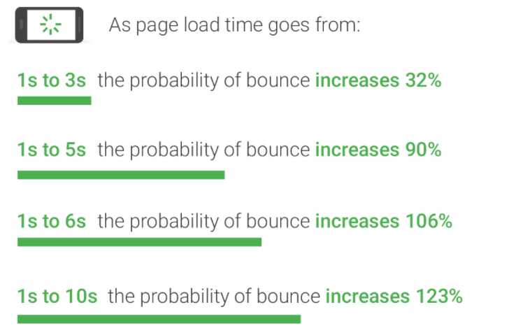
Users do not have the patience to wait for all our resources to load. The longer time it takes for the initial render, the more likely it is for the user to leave the page.
When it comes to the critical rendering path, what we care about is the initial page render; how much time does it take, and how can we improve it?
I listed some general methods we can use to optimise the CRP. Let's examine them.
Minimise HTML, CSS and JavaScript resources
We can all agree that some characters present in our code aren't needed. Mostly, they're just there to ensure readability and understandability. Examples of such characters are whitespaces, comments, using console.log() to manually test code in JavaScript, etc. Though these make coding easy in the development process, they're not required in production.
We must minimise our source files, removing unnecessary code or characters. Doing so will reduce the file sizes and therefore, be loaded faster by browsers. The earlier the browser gets the files, the earlier it can start parsing.
You can manually remove such characters but for huge source files, you should automate the process with minimisation tools.
Fetch only critical resources
We're more interested in the initial page load, right? Study your website and learn which resources are not needed as the page loads. Only load the most crucial resources first, and use JavaScript to dynamically load resources that don't matter on page load after the document is fully ready.
For CSS, instead of writing our media queries in a single file, we can specify that some stylesheets be loaded only for specific screen sizes:
<link
  rel="stylesheet"
  media="screen and (min-width: 800px)"
  href="style-800.css"
/>
In the above example, the browser will only fetch the file style-800.css only when the current screen is at least 800px wide.
Use JavaScript when and where needed
Earlier we learnt how JavaScript execution can block DOM and CSSOM construction. Introduce scripts in the right places in your document. For scripts that cannot be placed at the end of the <body>, use the async keyword to make it asynchronous. However, note that the async keyword only works for external scripts.
Also, load your script lazily. What this means is, to fetch only the necessary JavaScript when the page is ready, and fetch other scripts when they're needed. If you've been using React or Vue, you probably know what I'm talking about.
If you have any other suggestions or questions, please leave them in the comment section below.
Otherwise, if you like what you've read, kindly like and share the article.
See you in my next one, and thanks for reading. 🤗